Transactional Email Platform
- Design Systems
- Component Libraries
- Figma-to-Code
- Role
- Lead Designer & Developer
- Stack
- React, TypeScript, React Email, Tailwind, Figma
The Short Version
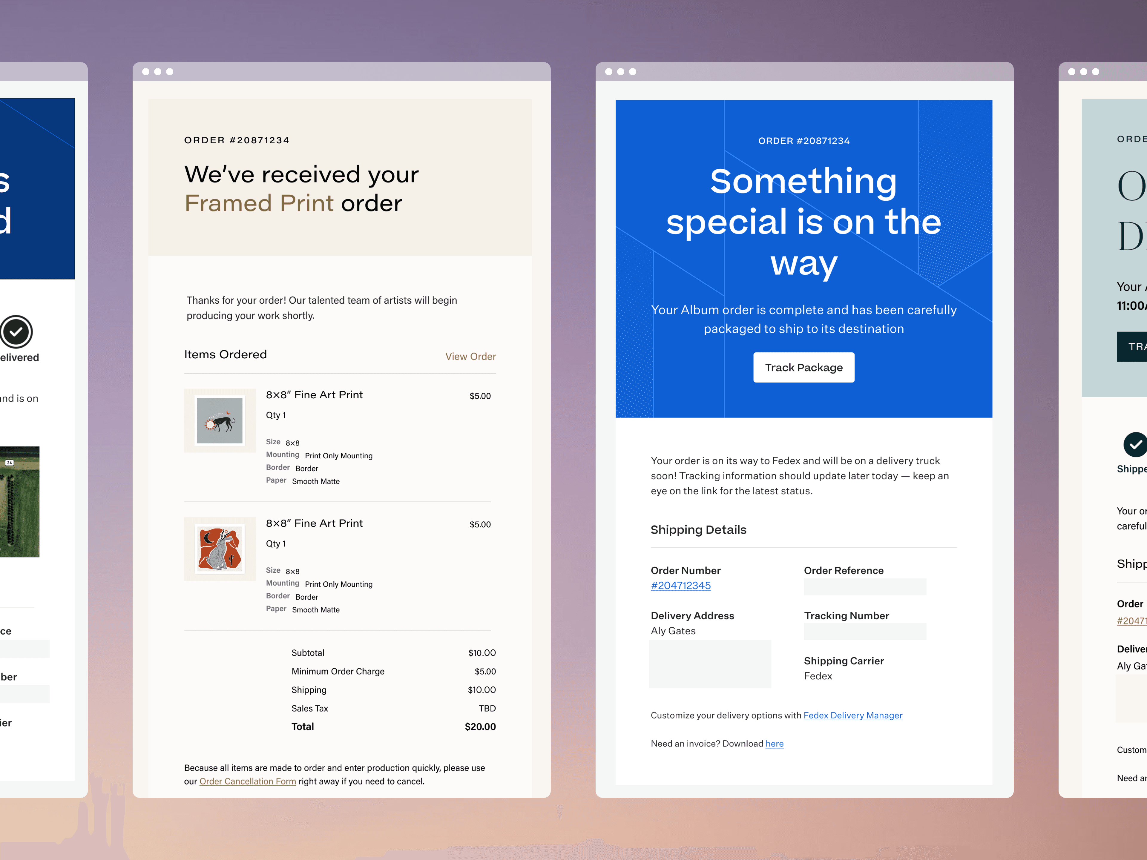
Every print order placed with WHCC or ProDPI triggers a chain of transactional emails, from the receipt through shipping, delivery, and pickup, adding up to about 3,000 sends a day across both brands. Each one carries order-critical details, so they have to arrive on time and without errors. I designed and built the system behind them from scratch, in Figma and in code.
- Redesign for both brands: I brought templates that hadn't changed in about ten years up to date with their current brand identities.
- One component library: I set up the library on React Email so email's rendering workarounds live in one place, and teammates now ship new templates on their own.
- Email-safe tokens: I translated the existing design system into tokens that work within email's CSS limits, so the emails share a visual language with the web app and marketing site.
- Validated sends: I generated a JSON schema from the TypeScript types for the backend to validate against, which keeps a broken template from ever reaching a customer.
Problem
No safe way to iterate
HTML email doesn't render like a website. There's no flexbox, no grid, limited CSS support, and every client has its own rendering engine (in fact, Outlook uses the same one as Microsoft Word). The only layout tool that works reliably everywhere is nested tables with inline styles:
<table cellpadding="0" cellspacing="0" border="0" align="center"> <tr> <td> <table border="0" cellpadding="0" cellspacing="0"> <tr> <td style="font-family: Helvetica, Arial, sans-serif; font-size: 15px; line-height: 22px; color: #333333;" > Your order has shipped, #{{order_number}} </td> </tr> </table> </td> </tr></table>Yuck! Without a component system abstracting this away, making even a small change meant editing raw table markup by hand and testing across a dozen rendering engines, with no guarantee it wouldn't break somewhere you didn't check.
Outdated visual design
The brands had evolved significantly over ten years, but the emails never kept up because updating them all was too costly to justify.
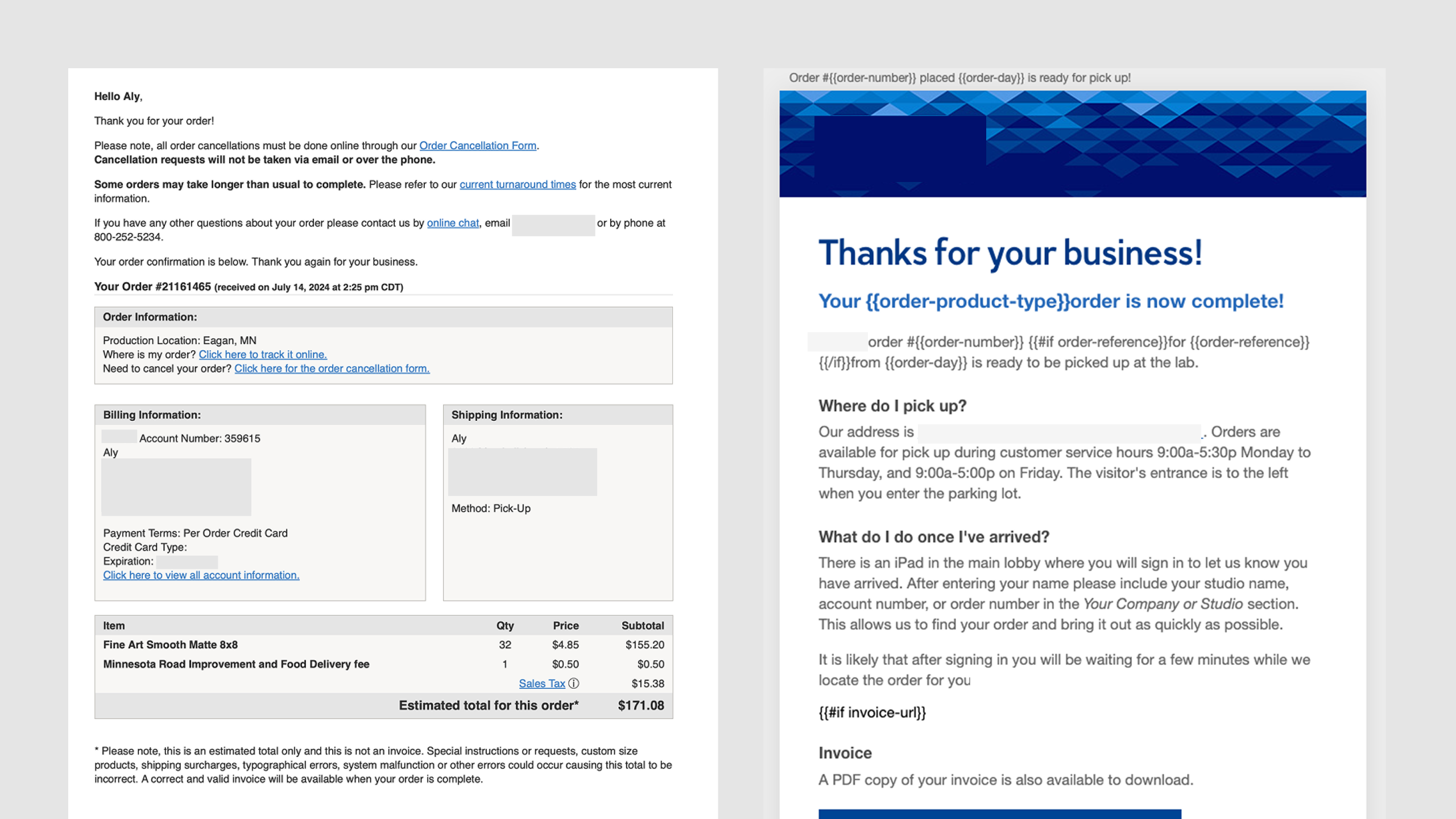
This meant a disjointed brand experience for users who received emails from both brands.
No component library for email
Each email template was designed as its own standalone artifact. There were no shared components across templates: every header, footer, button, and content block was recreated from scratch per email, per brand.
<table width="100%" cellpadding="0" cellspacing="0" border="0" style="background-color: #f5f5f5; padding: 24px 0;"> <tr> <td align="center"> <table width="600" cellpadding="0" cellspacing="0" border="0" style="background-color: #ffffff; font-family: Helvetica, Arial, sans-serif;" > <tr> <td style="padding: 20px 24px; border-bottom: 1px solid #e0e0e0;"> <img src="https://example.com/logo.png" width="120" height="32" alt="Logo" style="display: block; border: 0;" /> </td> </tr> <tr> <td style="padding: 24px; font-size: 15px; line-height: 22px; color: #333333;" > Hi {{customer_name}}, thanks for order <strong>#{{order_number}}</strong>. </td> </tr> <tr> <td style="padding: 0 24px 16px;"> <table width="100%" cellpadding="0" cellspacing="0" border="0" style="border: 1px solid #e0e0e0; background-color: #f5f5f5;" > <tr> <td style="padding: 10px 14px; background-color: #e0e0e0; font-size: 14px; font-weight: bold;" > Order Information: </td> </tr> <tr> <td style="padding: 14px; font-size: 14px; color: #333333;"> Order Number: <a href="{{order_url}}" style="color: #0066cc;" >#{{order_number}}</a ><br /> Order Date: {{order_date}} </td> </tr> </table> </td> </tr> <!-- same nested table again for Billing, Shipping, line items, footer… --> </table> </td> </tr></table>Approach
Design the system first
The first step was getting the emails to actually look like the brands they represent today. I worked within the existing design system used for the web app to bring the email templates in line with the current brand identities.
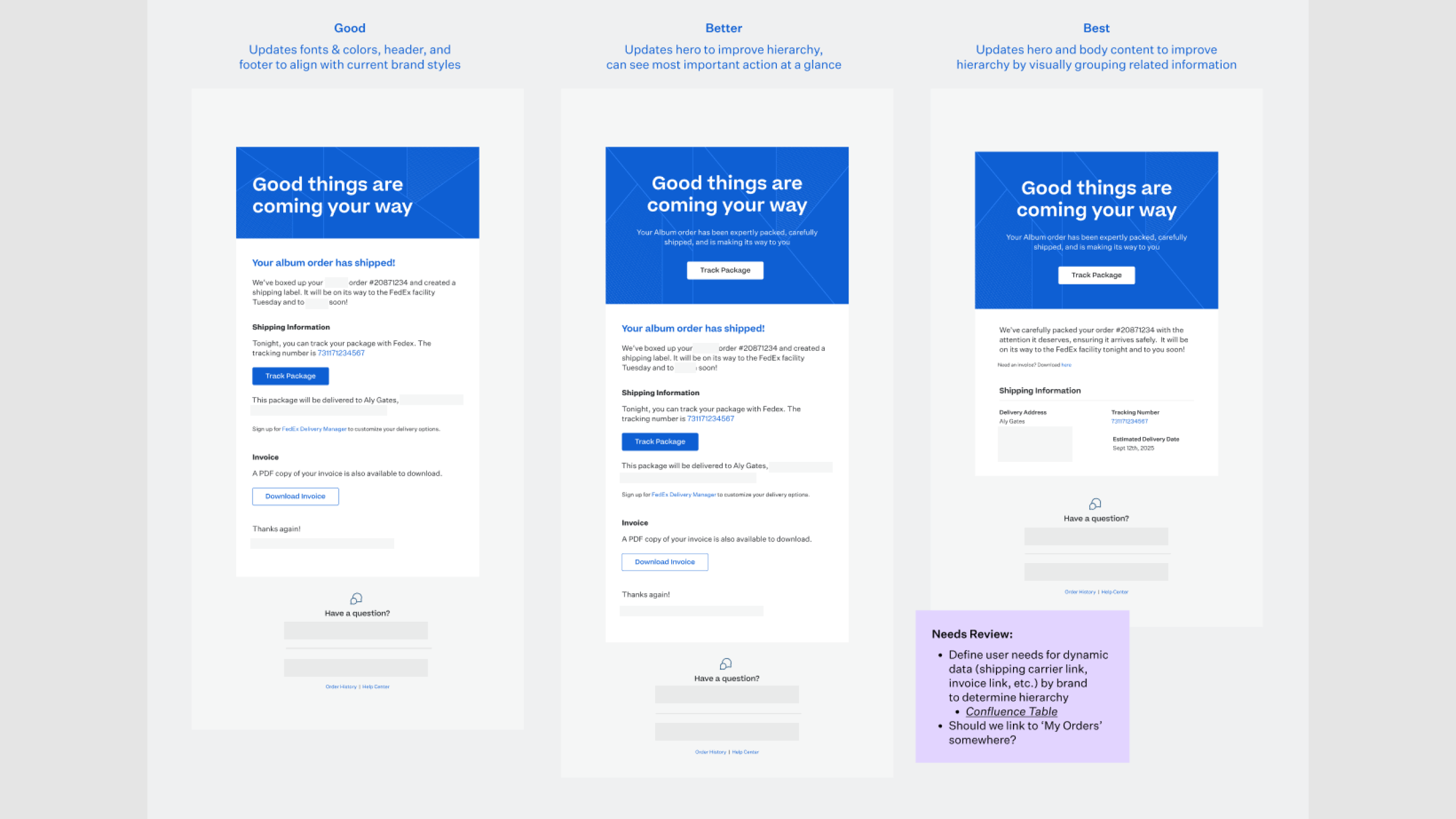
Each template went through initial exploration, stakeholder review, and iteration before any code was written. Once the layouts were settled, I took them apart. I wanted every piece to exist exactly once.
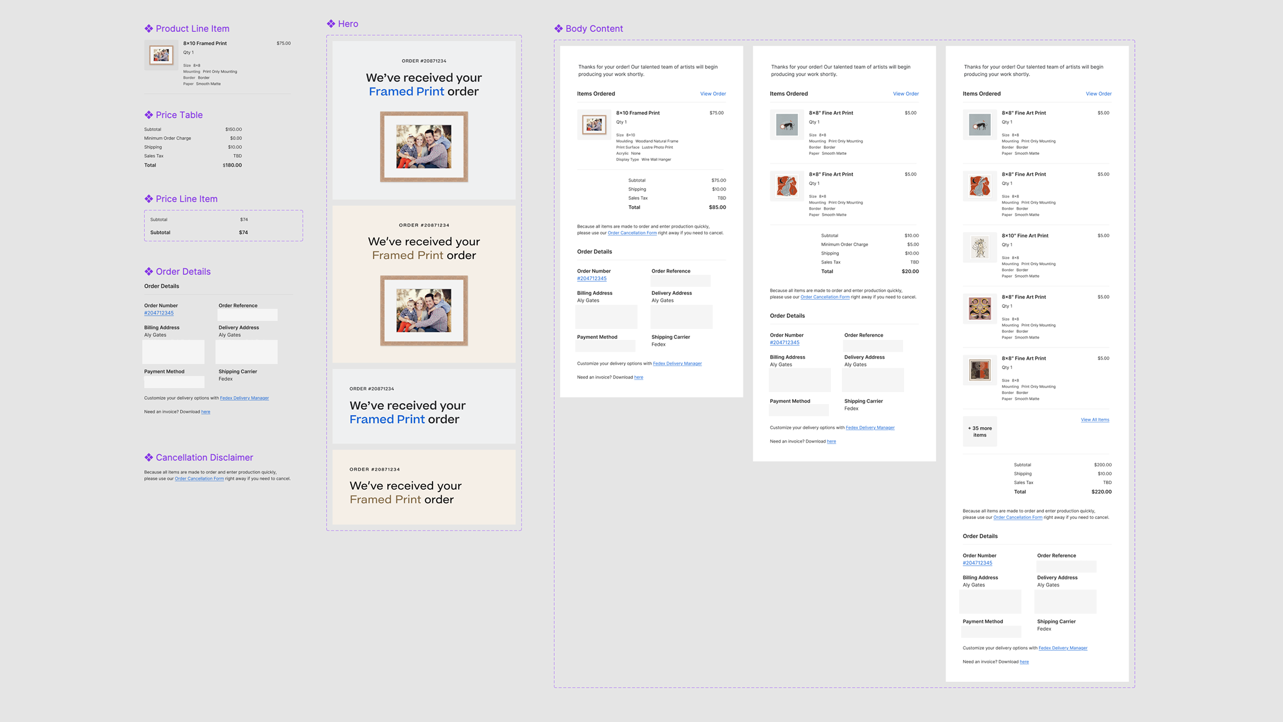
The smallest atoms were tokens from the existing design system. Those combined into single-purpose pieces like Product Line Item and Price Line Item, which then combined into larger sections like Item Table and Price Table.
Together, they made up the email component library in Figma that every template was assembled from.
Build the foundation
With the design work done, I moved into code.
I started with a Layout component that wraps every email, sets the brand in context, and loads that brand's Tailwind theme.
import { BrandProvider, EmailTheme, Html } from "@react-email/components";import { themeConfig } from "@/config";
export function Layout({ brand, children }: LayoutProps) {  return (    <BrandProvider brand={brand}>      <EmailTheme config={themeConfig[brand]}>        <Html>          <Header />          {children}          <Footer />        </Html>      </EmailTheme>    </BrandProvider>  );}
Each brand's theme lives in its own config. The second brand extends the first and only overrides what's different, so changing a value they share, like spacing, updates both brands at once.
// brands/brandA/config.tsexport const config = {  theme: {    fontFamily: {      display: ["Serif-Font", "serif"],      body: ["Sans-Font", "sans-serif"],    },    backgroundColor: {      "brand-strong": "#0E5FD3",      "neutral-secondary": "#F5F6F6",    },    borderRadius: {      button: "4px",    },    spacing: {      section: "32px",      gutter: "24px",    },  },};
// brands/brandB/config.tsimport { merge } from "lodash";import { config as brandAConfig } from "@/brands/brandA/config";
const overrides = {  theme: {    fontFamily: {      display: ["Different-Serif", "serif"],      body: ["Different-Sans", "sans-serif"],    },    backgroundColor: {      "brand-strong": "#09272F",      "neutral-secondary": "#F9F5F0",    },    borderRadius: {      button: "0px",    },  },};
export const config = merge({}, brandAConfig, overrides);
One component tree, two brands, zero duplicated templates.
Build real components
With the foundation in place, I began building the components, keeping the same names and variant structure as defined in Figma.
Each component was built on top of React Email's base components, which are already tested against the major email clients.
import { Column, Img, Row, Section, Text } from "@react-email/components";
export function ProductLineItem({  name,  quantity,  total,  imageUrl,}: ProductLineItemProps) {  return (    <Section>      <Row>        <Column className="w-[72px] pr-4">          <Img src={imageUrl} width="72" height="72" alt="" />        </Column>        <Column>          <Text className="text-neutral-primary m-0 text-base font-medium">            {name}          </Text>          <Text className="text-neutral-secondary m-0 text-sm">            Qty {quantity}          </Text>        </Column>        <Column align="right">          <Text className="text-neutral-primary m-0 text-base">{total}</Text>        </Column>      </Row>    </Section>  );}
All of the table markup lives inside those primitives. I never have to write or even look at a <table> element.
Components that need brand-specific behavior read from the same context the Layout sets. A Button applies brand-specific spacing and casing without the template needing to know which brand it's rendering.
export function Button({ url, label, variant }: ButtonProps) { const brand = useContext(BrandContext); const classes = cx(baseClasses, variantClasses[variant], brandStyles[brand]); return ( <EmailButton href={url} className={classes}> {label} </EmailButton> );}Make it safe to send
The last piece was ensuring an email couldn't break on send. I moved every template's props into one shared types.ts and added a build step that reads those types and generates a JSON schema for each template, listing which props are required and which are optional.
{ "OrderShipped": { "required": [ "brand", "email", "orderNumber", "orderProductType", "shippingCarrier", "trackingNumbers", "trackingUrl" ], "optional": ["invoiceUrl", "shippingToName", "shippingToAddress"] }}The backend notifications service checks props against that schema before rendering. Generating it from types.ts means it can't drift; a mismatch fails the build instead of landing in someone's inbox.
Impact
The platform sends roughly 3,000 emails a day across both brands. Those emails now match the web app and marketing site, which means an order update no longer feels like it's from a different company.
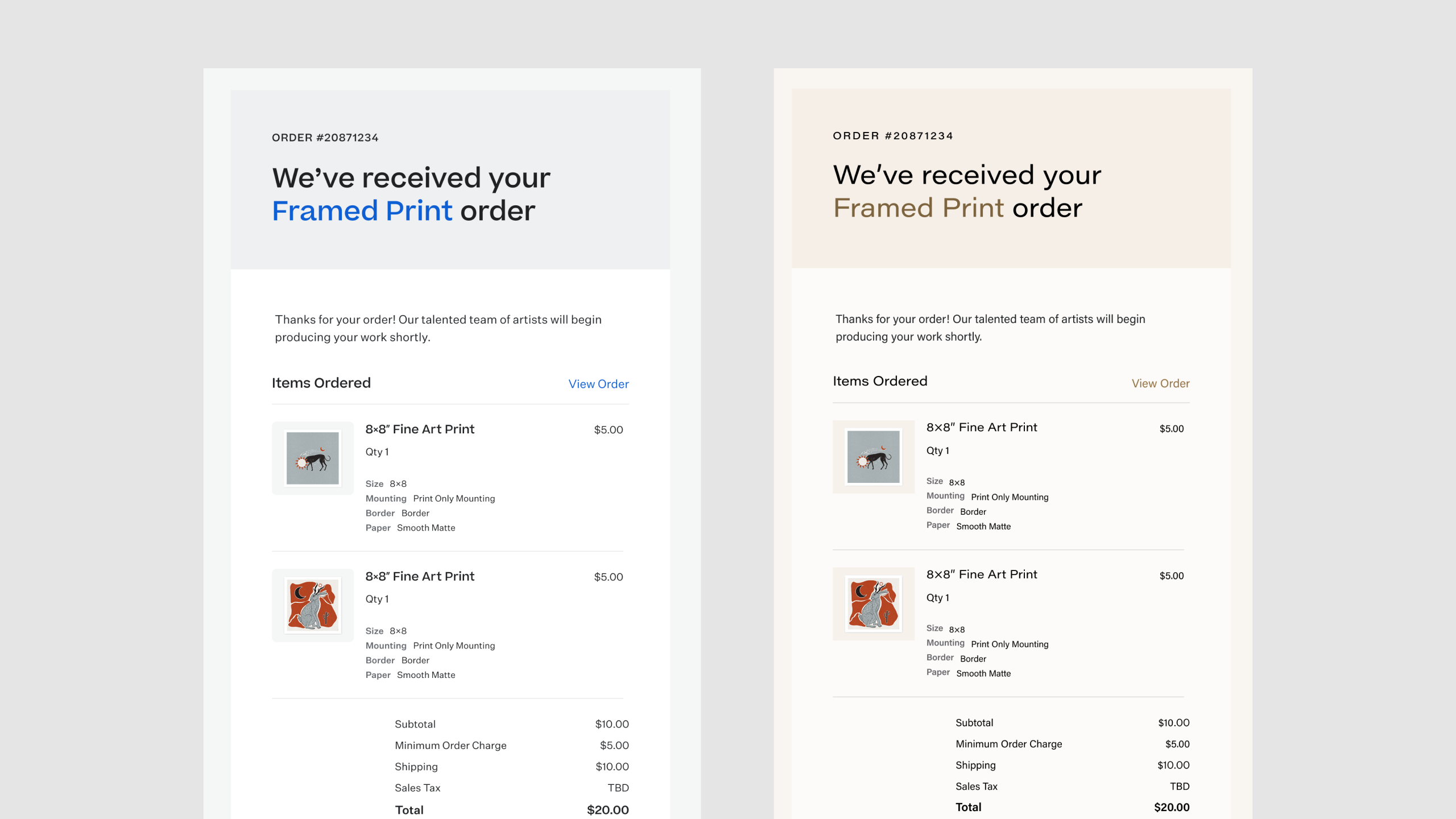
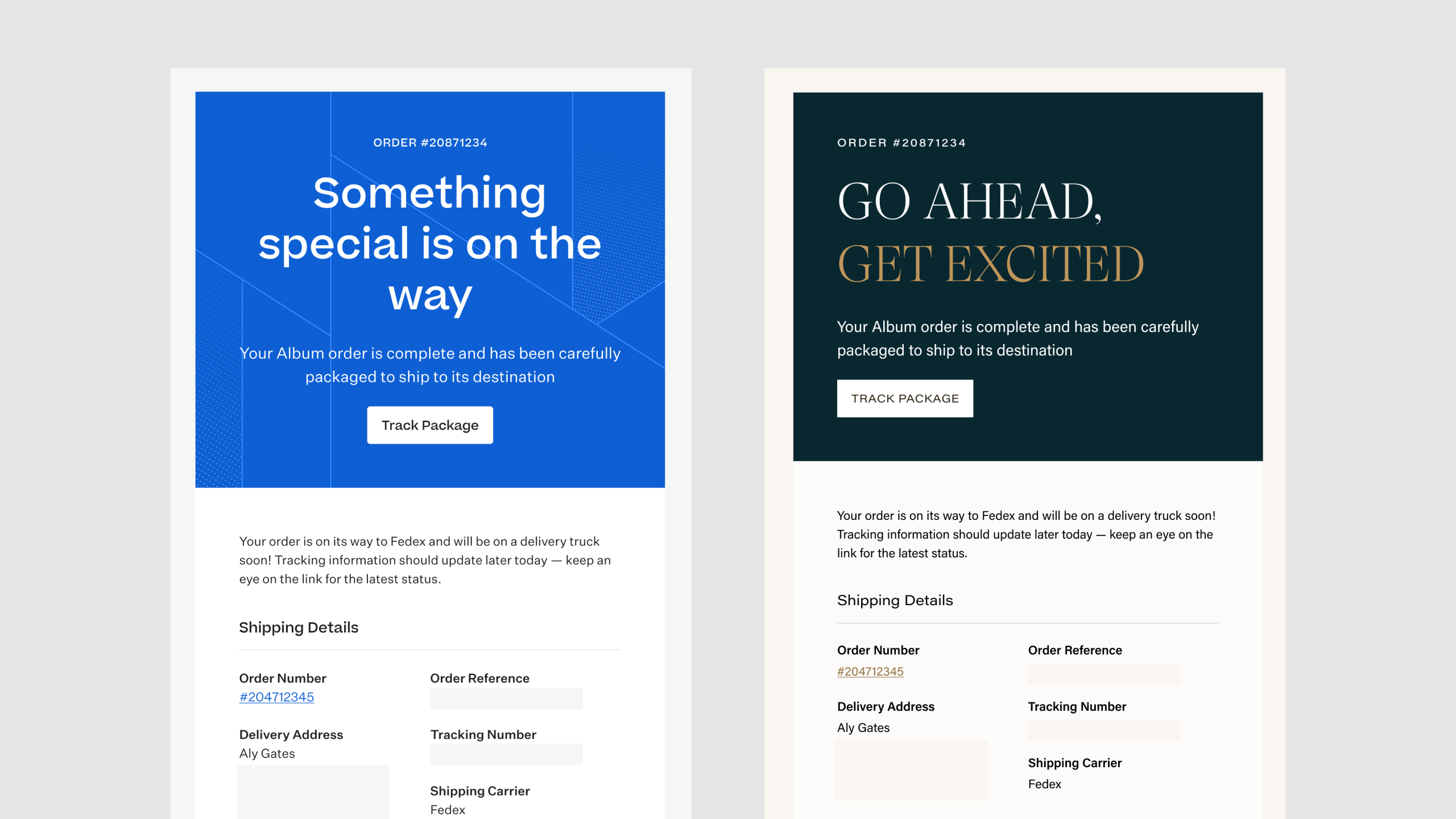
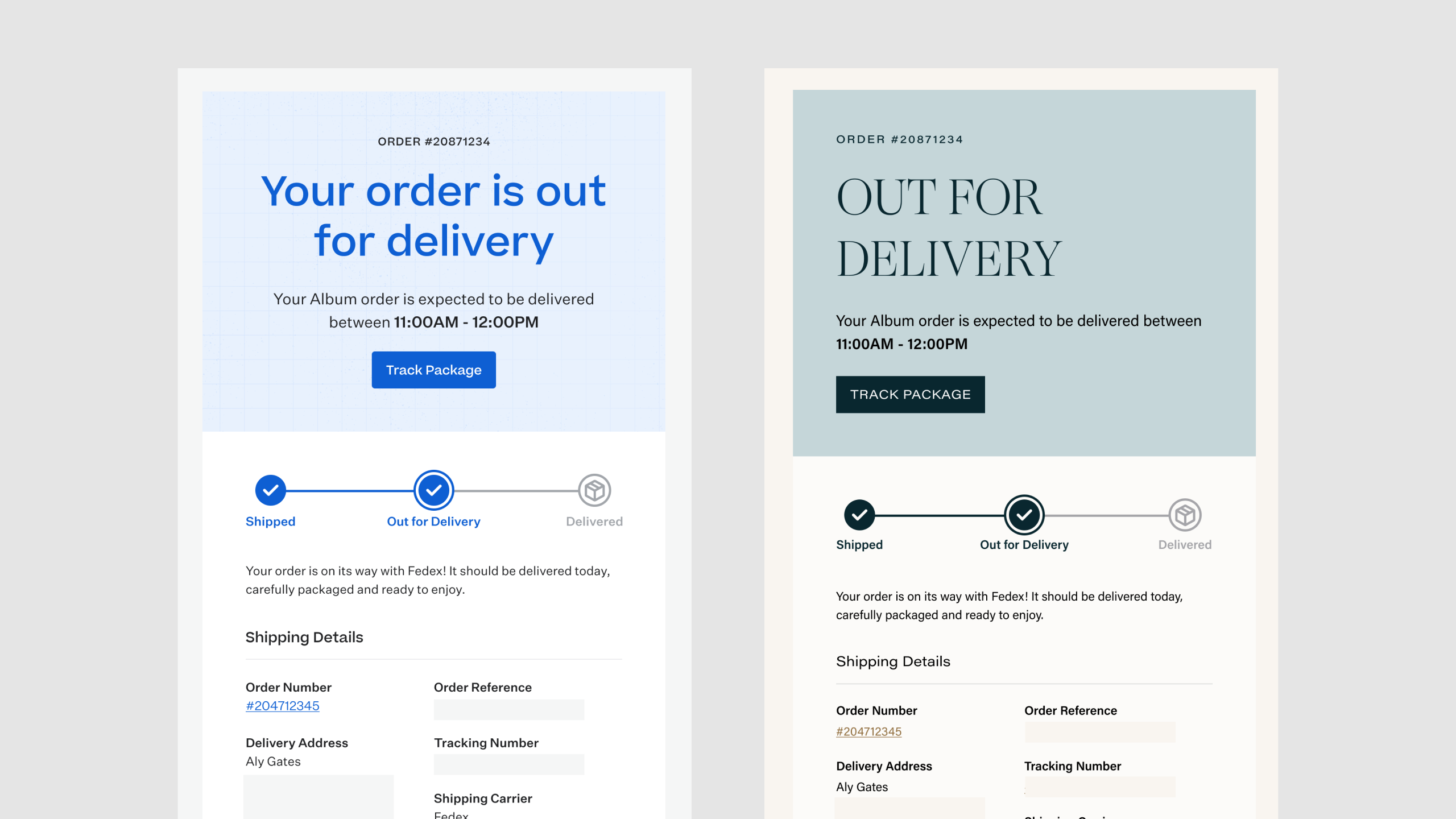
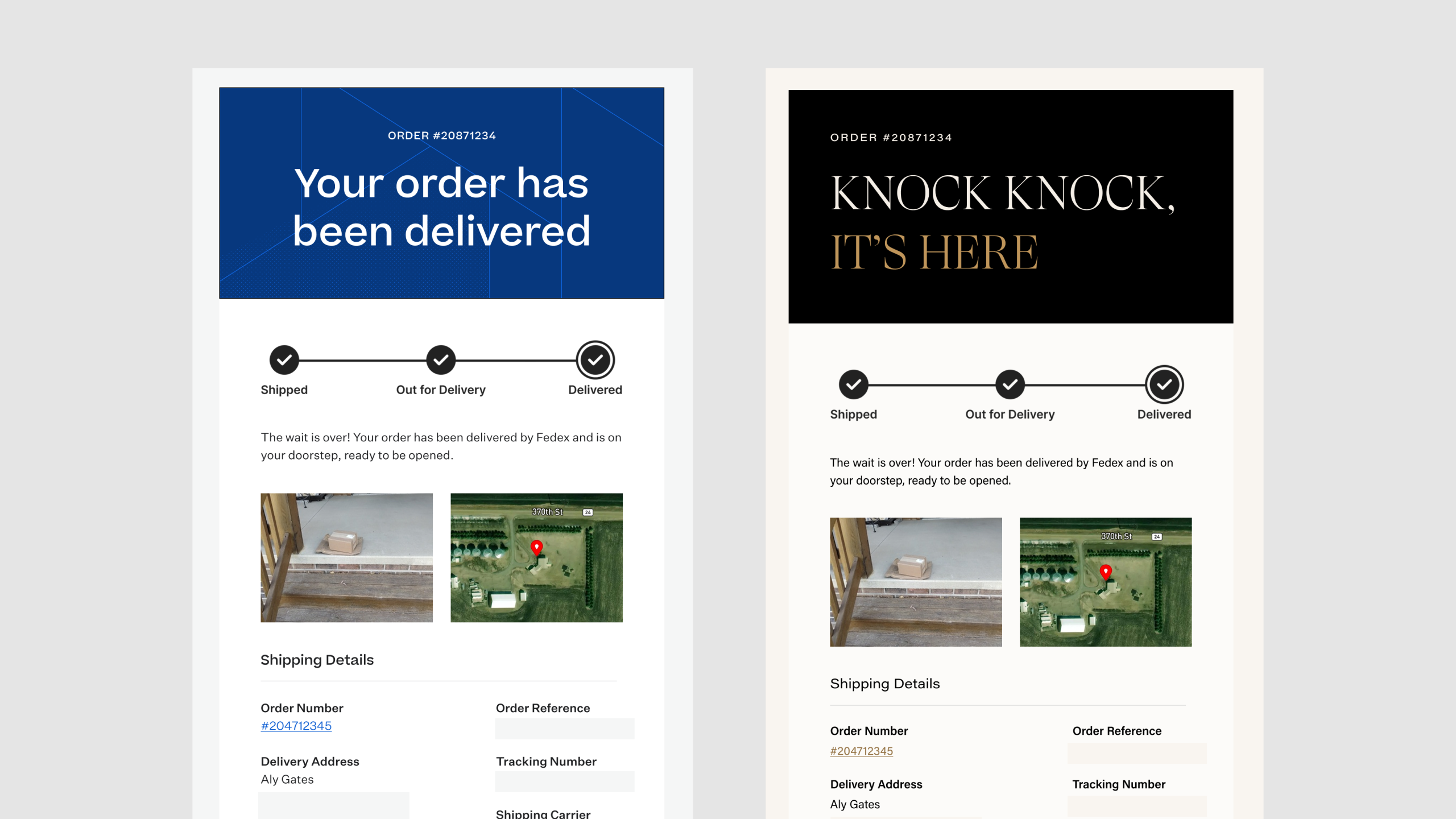
Updating a template or building a new one is mostly a matter of arranging components that already exist. Since the table markup and client quirks live inside the primitives, contributors don't need any background in email development to work in the codebase.
Key Learnings
Not every design token survives the trip into email. I spent the early Figma work deciding which tokens could translate directly and which needed email-specific versions, and that made the component build much more predictable.