Legacy CMS Migration
- Component Architecture
- Content Modeling
- Information Architecture
- Role
- Lead Developer
- Stack
- Twig, TypeScript, SCSS, Vite, PHP, Craft CMS, Figma
- Live
- ProDPI
The Short Version
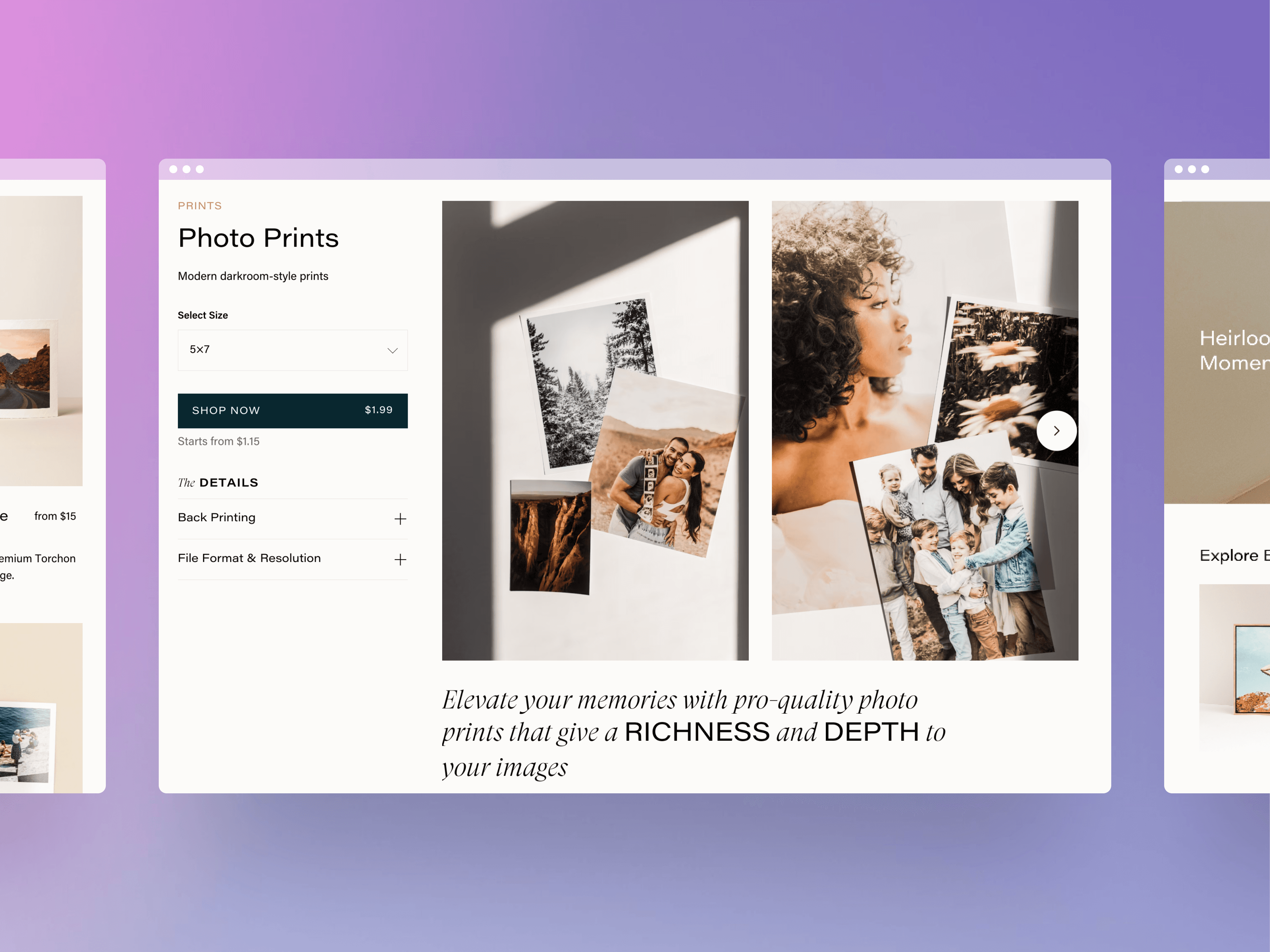
ProDPI is a direct-to-consumer print lab, and its website is the storefront where customers choose sizes, materials, and finishes before designing their product. I led a complete rebuild of the site, moving it off an aging CMS and onto a component-based system.
- 15 reusable sections: I audited the old site's content and architected the storefront as 15 sections on a shared content model, so the marketing manager now publishes new pages without an engineering ticket.
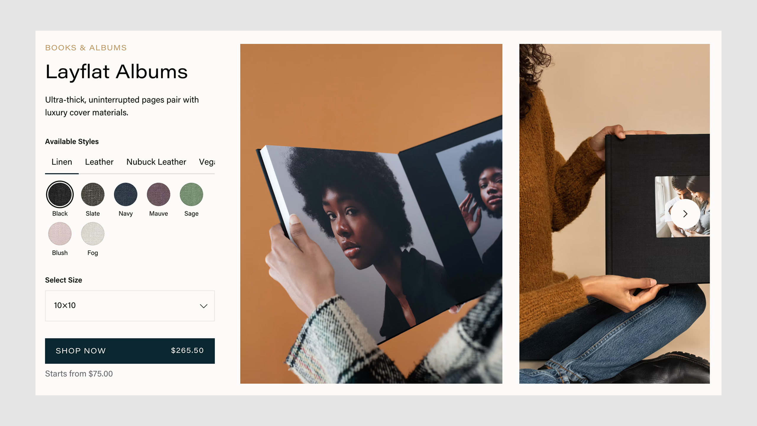
- 38 products, one model: Each product had its own options to explain before handing the customer into the editor with those choices selected. One shared product model now handles them all, from photo prints to layflat albums.
- Design tokens and conventions: I set up a semantic token layer for the design system and wrote the repo's conventions as rules for both developers and agents.
- 50+ page migration: I planned and led the migration in phases, coordinating the other developers and the marketing manager through the March 2026 launch.
Problem
No shared architecture
The site had no component model. Every non-product page was its own template, and the 38 product pages were split across six templates that did essentially the same job.
templates/├── landing-fall-promo.twig├── landing-holiday.twig├── landing-spring.twig├── landing-wedding.twig├── product-prints.twig├── product-wall-art.twig├── product-cards.twig├── product-albums.twig├── product-canvas.twig└── product-metal.twigEvery new page cost engineering time, and that cost grew with the site.
Every section lived in one file
Pages on the site were built from sections, and each section type was a hand-coded case block inside a single switch statement.
{% switch block.type.handle %}
  {% case "fullHero" %}    {% set img1 = block.heroImage.one() %}    {% set transforms1 = img1.transforms %}    {% set x = 'center' %}    {% set y = 'center' %}    {% if img1.hasFocalPoint %}      {% set x = img1.focalPoint | first * 100 ~ '%' %}      {% set y = img1.focalPoint | last * 100 ~ '%' %}    {% endif %}    <div class="hero-wide" style="padding: 80px 0;">      <img src="{{ transforms1.src() }}"           srcset="{{ transforms1.srcset() }}"           sizes="100vw"           style="object-position: {{ x }} {{ y }};"           class="cover">      <h1 class="hero-title">{{ block.heading }}</h1>      <p class="hero-copy">{{ block.text }}</p>      <a href="{{ block.linkUrl }}" class="btn btn-primary">        {{ block.linkText }}      </a>    </div>
  {% case "splitHero" %}    {% set img2 = block.sideImage.one() %}    {% set transforms2 = img2.transforms %}    {% set posX = 'center' %}    {% set posY = 'center' %}    {% if img2.hasFocalPoint %}      {% set posX = img2.focalPoint | first * 100 ~ '%' %}      {% set posY = img2.focalPoint | last * 100 ~ '%' %}    {% endif %}    <div class="split-hero" style="padding: 64px 0; background-color: {{ block.bgColor.hex }};">      <img src="{{ transforms2.src() }}"           srcset="{{ transforms2.srcset() }}"           sizes="50vw"           style="object-position: {{ posX }} {{ posY }};"           class="split-img">      <h2 class="split-heading">{{ block.headline }}</h2>      <div class="split-text">{{ block.body }}</div>      <a href="{{ block.ctaLink }}" class="button-dark">        {{ block.ctaLabel }}      </a>    </div>
  {% case "textCallout" %}    <div class="callout" style="padding: 48px 24px; background-color: {{ block.backgroundColor.hex }};">      <h3 class="callout-heading" style="color: {{ block.textColor.hex }};">        {{ block.title }}      </h3>      <p>{{ block.copy }}</p>      <a href="{{ block.buttonUrl }}" class="btn-outline">        {{ block.buttonText }}      </a>    </div>
  {# ...and the same again for every other section type #}
{% endswitch %}
Nothing documented how a section should look or what options it had. The code was the only spec, and nobody wanted to touch it because it was so fragile.
The site had aged out
The site was still running on Craft CMS 3, two major versions and about six years behind. Years of campaigns had also left it full of outdated pages and duplicate copy. Before migrating anything, someone had to figure out what was worth keeping.
Approach
Audit everything first
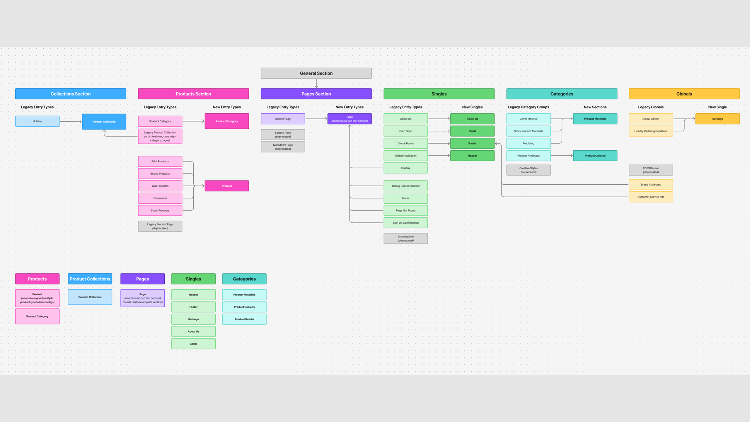
I catalogued every page on the old site and what was worth keeping, then reworked how products were grouped. That became the six category pages and the new navigation.
Design the sections
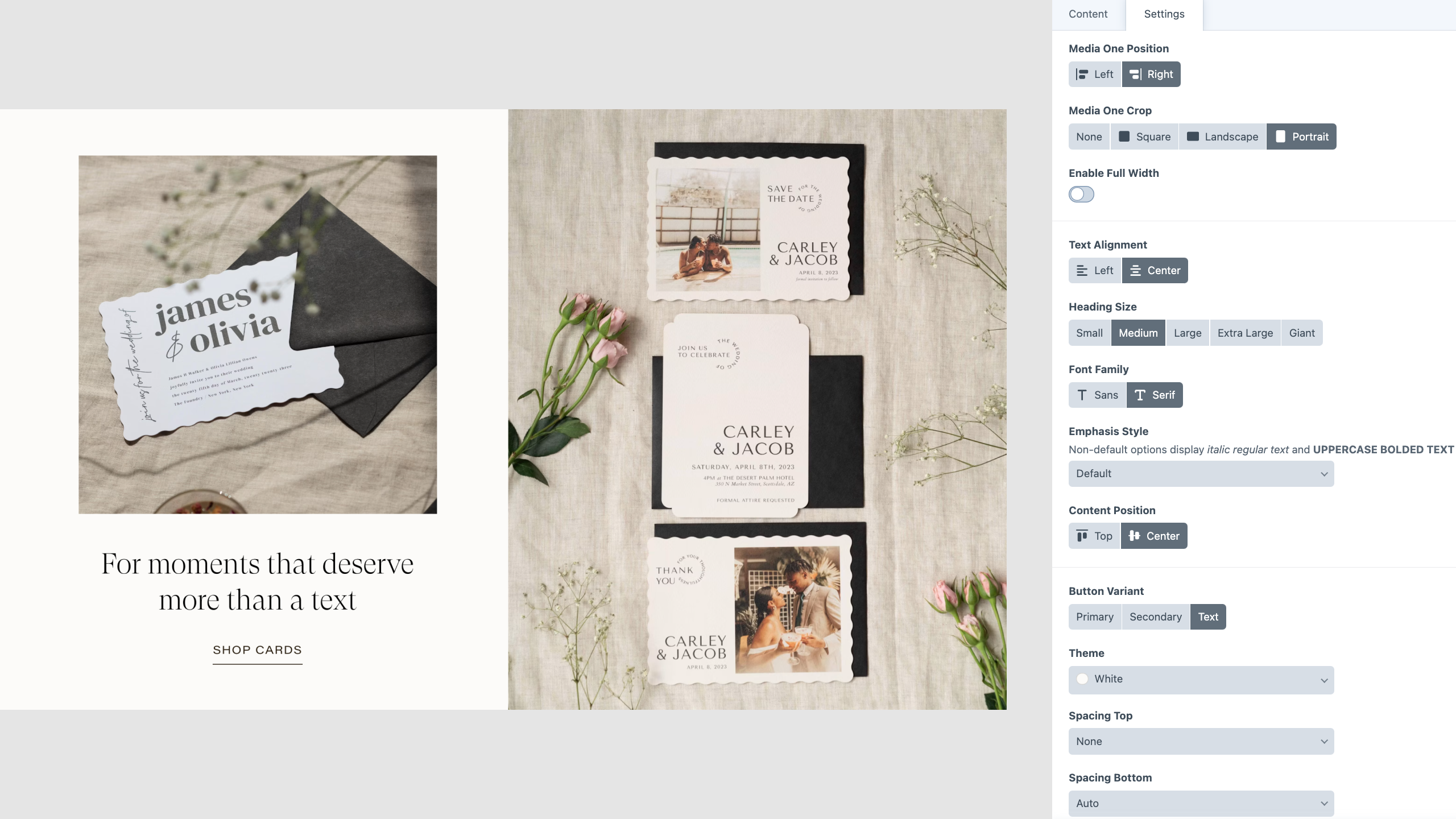
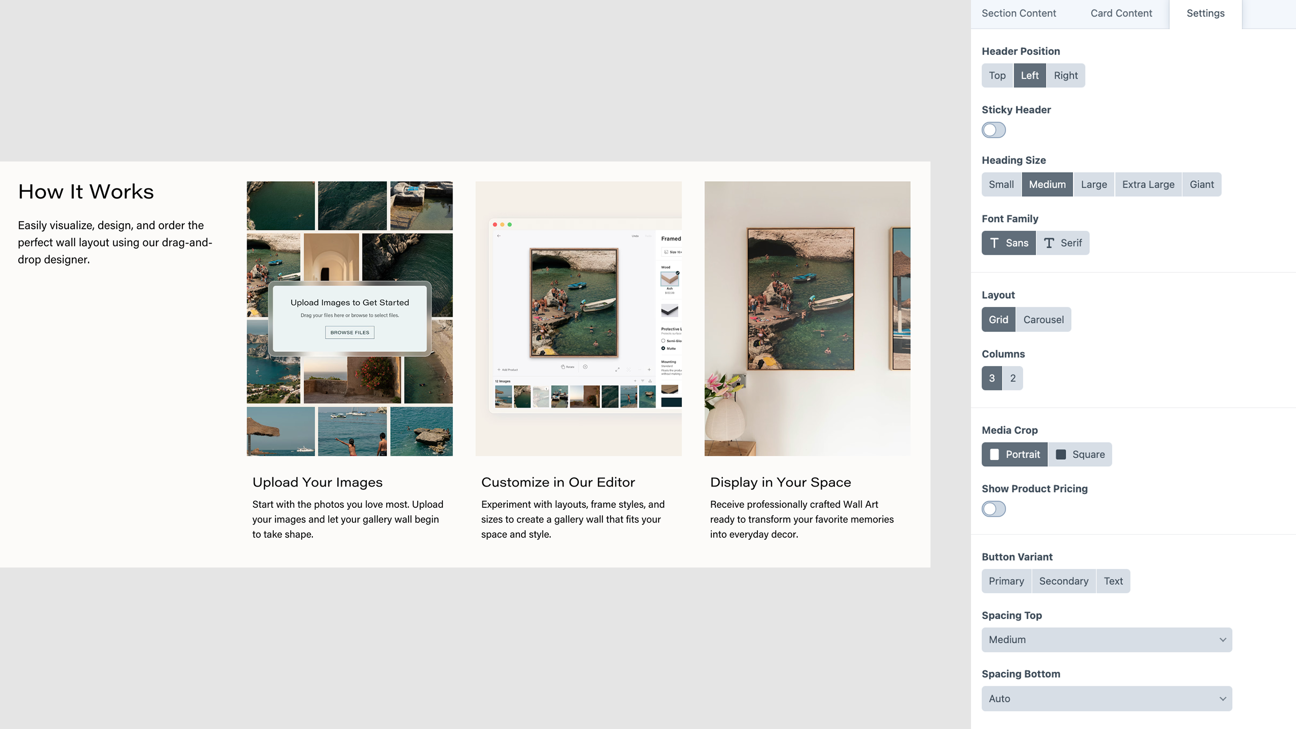
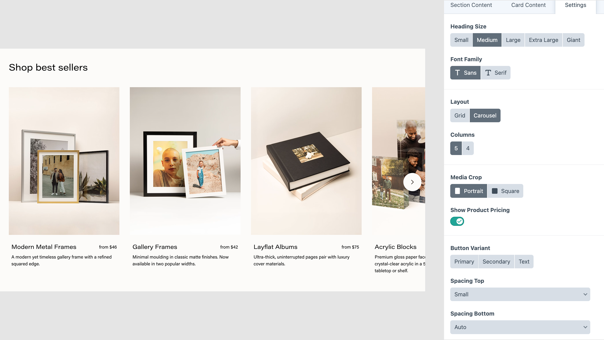
Working with the marketing manager, I defined the page types they needed and the sections that could cover them.
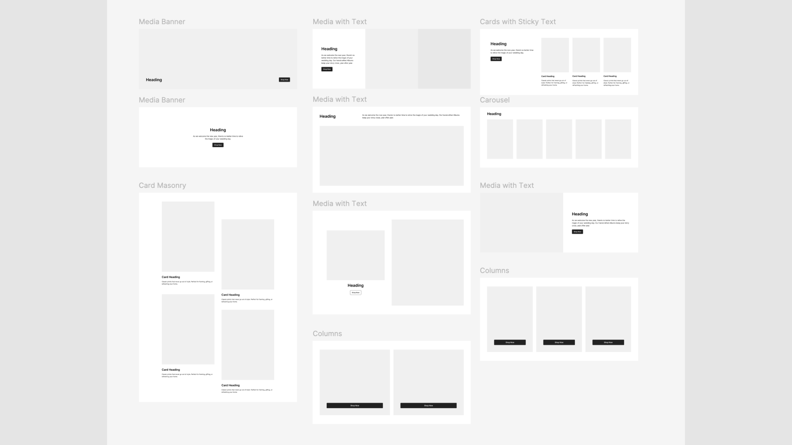
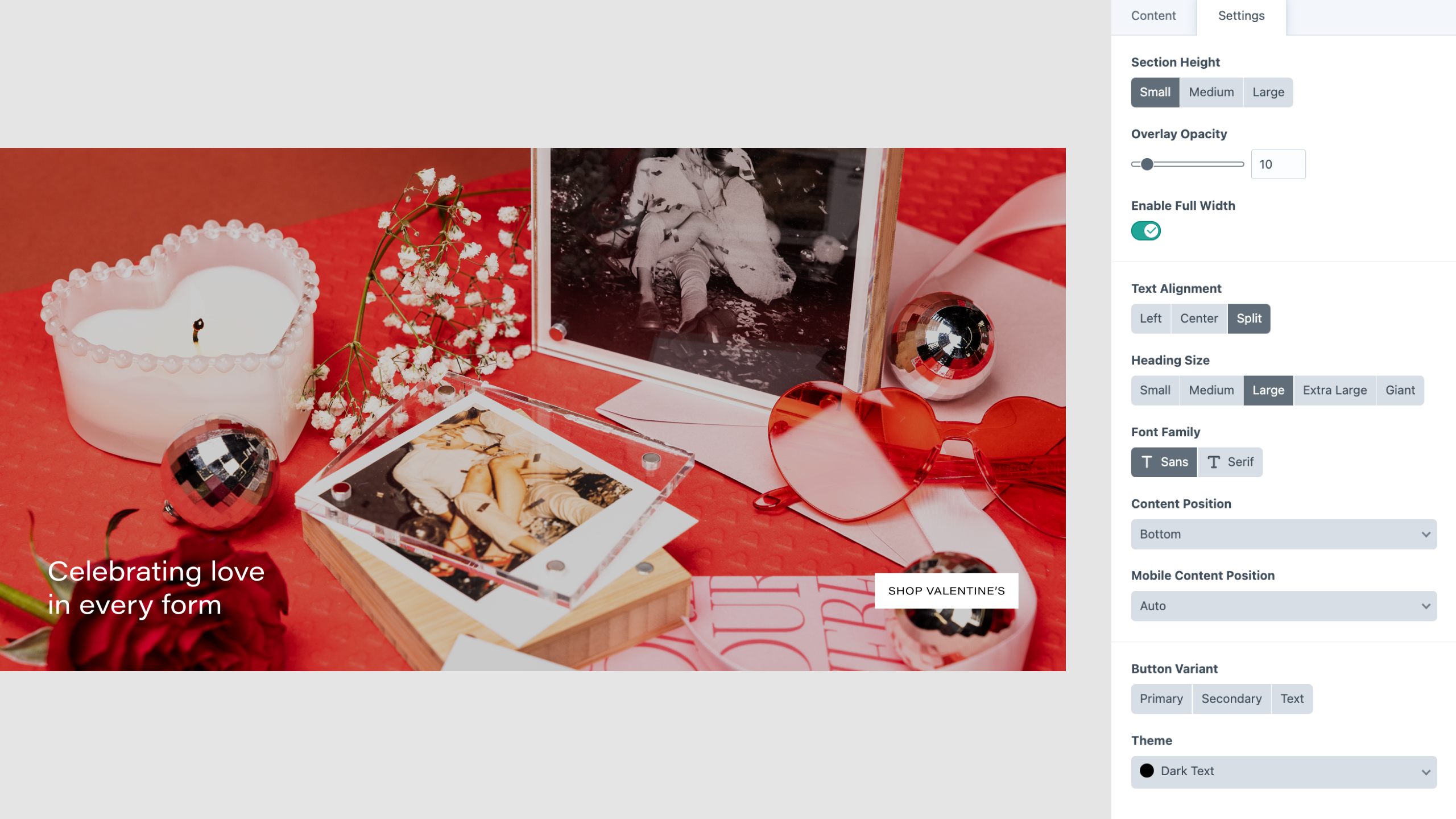
I took each wireframe through to a full design, then built the content model around how an author would actually use it. Sharing fields across sections meant a few simple options could compose a wide range of layouts.
Build on a shared foundation
With the design settled, I started building. Each section has its own file and shared pieces like images and buttons are written as components.
{% set title = section.title %}{% set body = section.body %}{% set media = section.media.one() %}{% set colorScheme = section.colorScheme.value %}{% set mediaSide = section.mediaSide.value %}{% set titleSize = section.titleSize.value %}
<section class="{{ rootClasses }}" data-color-scheme="{{ colorScheme }}">  <div class="{{ innerClasses }}">    <div class="{{ mediaWrapperClasses }}">      {% if media.kind == 'image' %}        {% include '_partials/picture' with {          asset: media,          class: 'cover',          sizes: '(min-width: 1024px) 50vw, 100vw'        } only %}      {% endif %}    </div>
    {% include '_partials/content-block' with {      title,      titleSize,      body,      links,    } only %}
  </div></section>
The settings selected in the CMS become the rootClasses above, one modifier class per choice, so the markup reads like the section's settings.
<section class="Section MediaText MediaText--mediaRight Section--compact Section--alignStart Section--mobileAlignCenter"></section>I also brought the full design system into the repo as tokens, with a semantic layer for color. This allows a brand color change to happen in one file.
:root { --bgColor-neutral-primary: var(--gold-1); --bgColor-neutral-secondary: var(--gold-2); --bgColor-brand-strong: var(--ocean-12); --fgColor-neutral-primary: var(--gray-12); --fgColor-brand-strong: var(--gold-8);}I also moved the site's legacy jQuery to TypeScript and wrote the repo's coding conventions as rules for both humans and agents, so new work follows the same patterns.
Consolidate the product pages
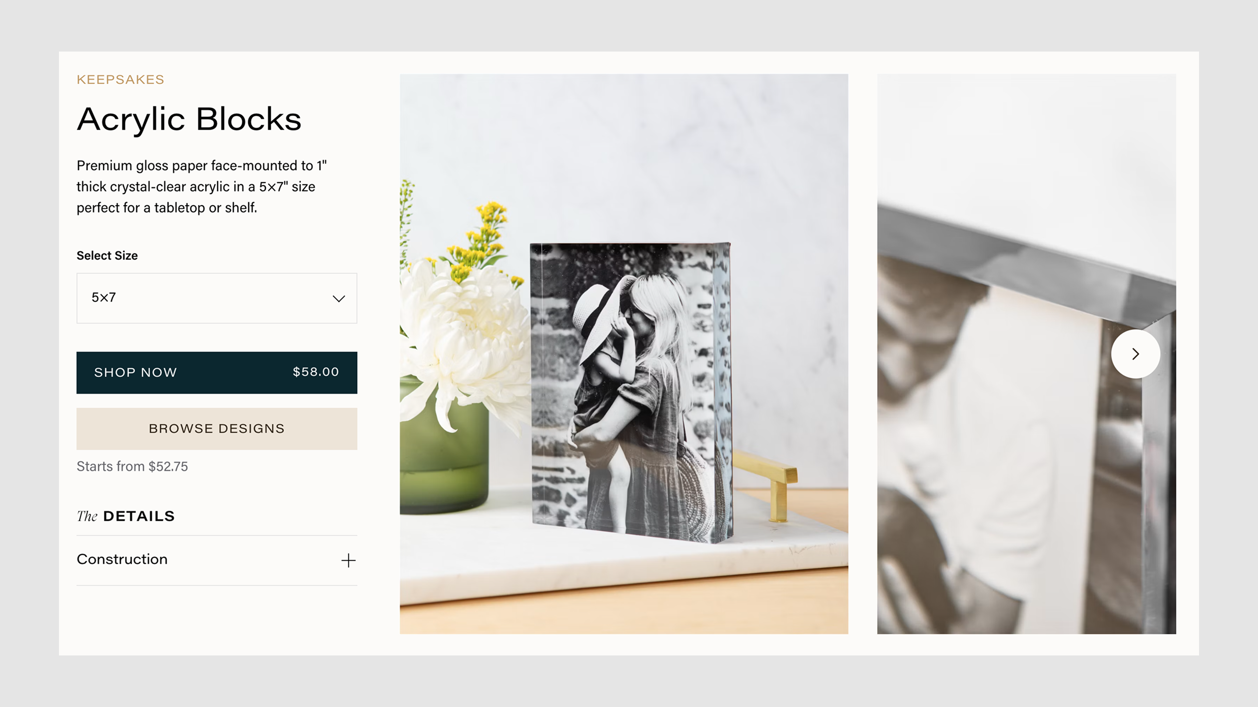
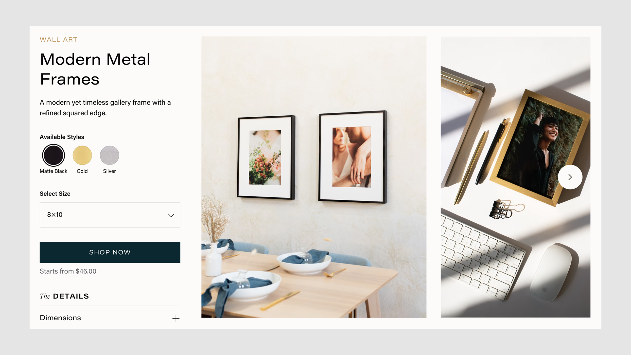
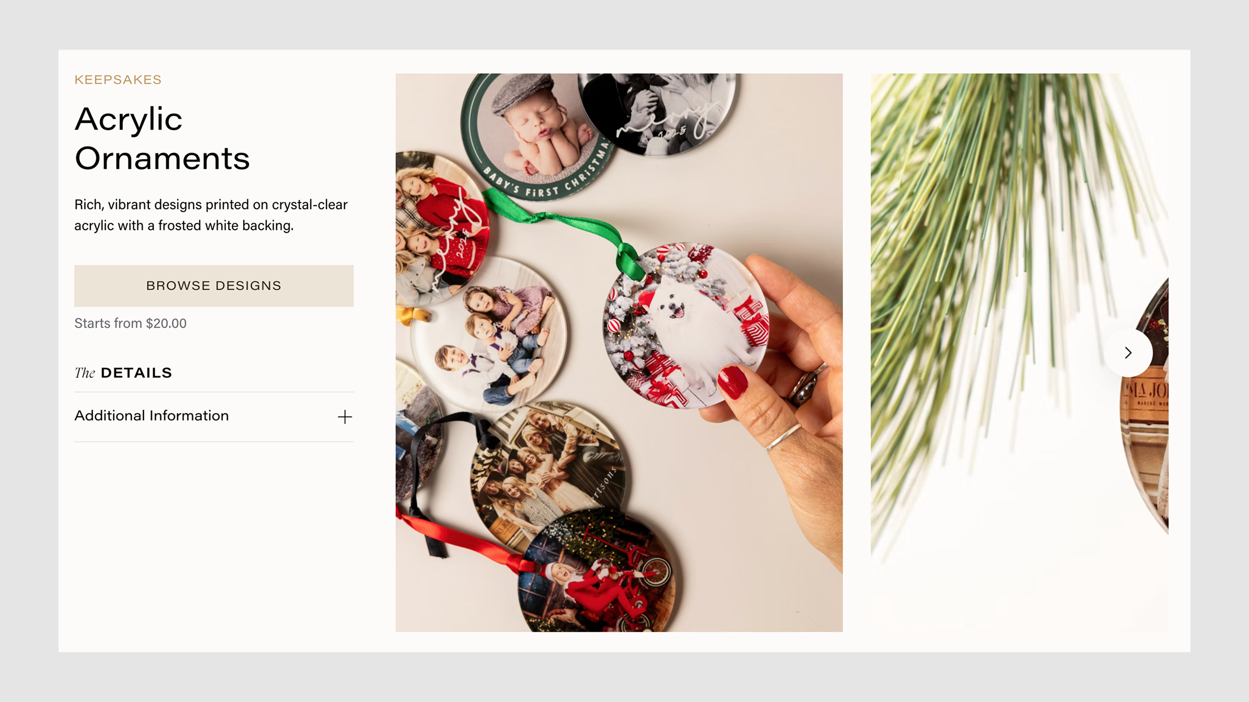
The same foundation let six product templates become one. A single field layout in the CMS covers every product, and details that used to need their own template, like an album's cover materials, became optional fields.
Run the migration and launch
The new site was a brand-new Craft 5 project. Craft 3 was full of bugs it would never get fixes for, and starting fresh got the site current without working through two major upgrades.
It also meant there was no automatic path for content, so 50+ pages moved by hand in three phases:
- Base content: existing copy and images from the old site
- Editorial content: new copy written for the new sections
- Field restructuring: mapping old fields to new ones where the content model changed
I wrote the tickets, tracked progress weekly, and kept the other developers and the marketing manager in sync through testing and launch.
Impact
The new storefront launched in March 2026, replacing the entire site at once: 50+ pages, the full product catalog, and a codebase rebuilt on a current platform.
New pages are now shipped without engineering. Other engineers and AI agents can contribute to the codebase because the patterns are documented. A site nobody wanted to touch is now one the whole team can work in.
Key Learnings
Starting from a fresh build, rather than lifting and shifting the old codebase, was the decision that made this project work. It also demonstrated how much harder an update gets the longer it waits.
I ran the project management along with the code, and next time I'd keep all of the tracking in one place. Progress was spread across Slack, Jira, and Confluence, and our team's move to Linear since then would have made that much easier.