Foundational Component System
- Design Systems
- Component Architecture
- Theming
- Role
- Frontend Engineer
- Stack
- Twig Components, Storybook, Stimulus, SCSS, Symfony
- Live
- Studio Projects
The Short Version
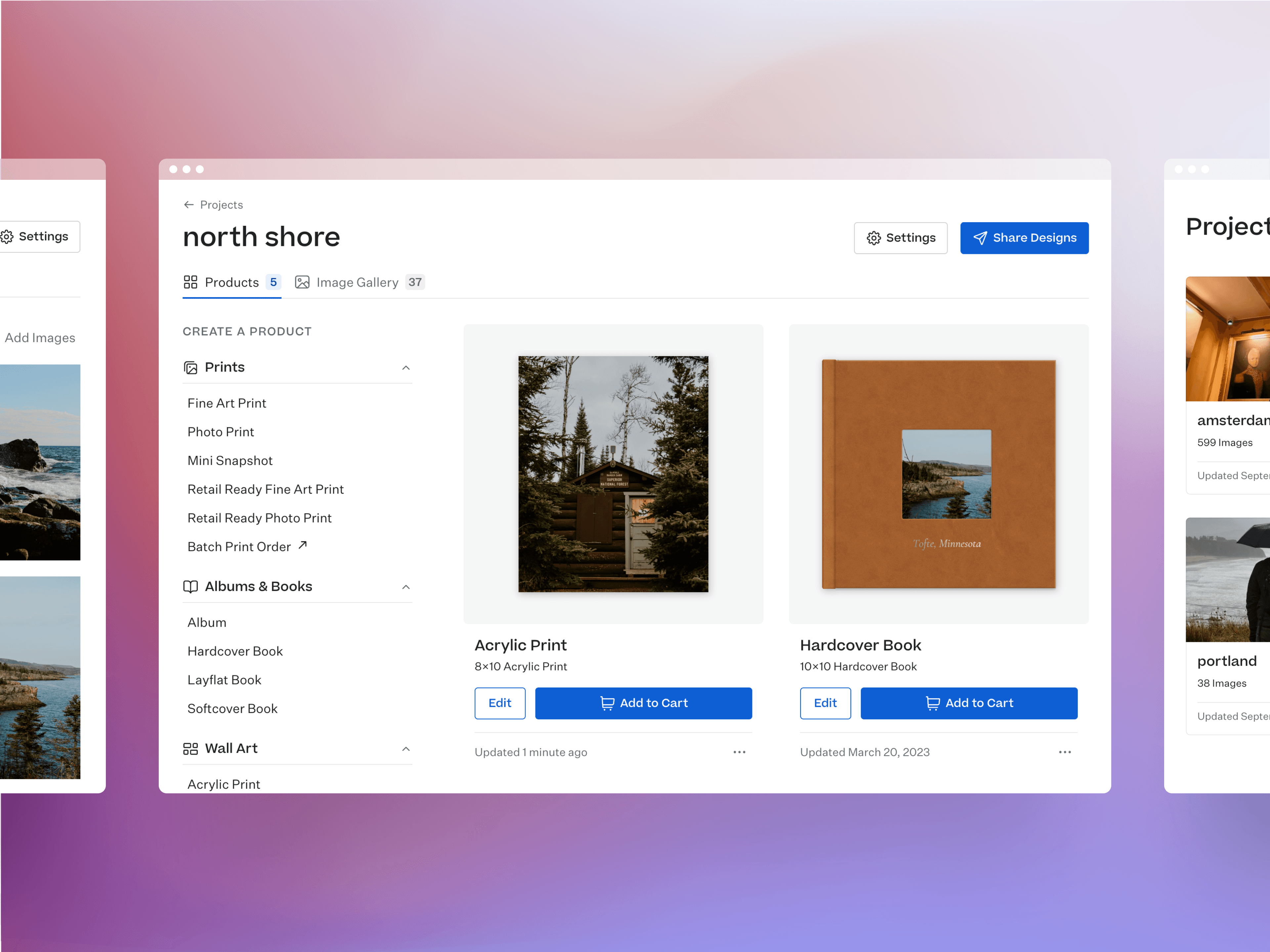
Studio Projects helps professional photographers organize gallery images and order print products for their clients. I joined a team of engineers and a UX/UI designer to move this multi-brand app off a legacy codebase with no real component model and rebuild it on Symfony's Twig Components.
- 40 core components: I built the first components of what became a comprehensive multi-brand library, and they set the patterns the rest followed for props, variants, and per-brand tokens.
- Layout and interaction: I built out layout primitives, cards, and interactive components like
Dropdownwith full keyboard navigation and ARIA support. - Storybook and tokens: I integrated the library into Storybook and tied each component to the design system's tokens, which brought production back in line with the designs in Figma. Contributors now build new features quickly from a shared design language.
- Team conventions: A year later, these patterns are the primary reference in the team's frontend conventions doc for both engineers and agents.
Problem
Custom tags instead of real components
The legacy templates used invented tag names directly in the markup and styled them the same way you'd style a div.
<panel accountSettings> <panelTitle largeHeader>Project Settings</panelTitle> <setting name=title> <settingLabel smallHeader>Title</settingLabel> <value>{{ project.title }}</value> </setting></panel>[accountSettings] { panelTitle { border-bottom: 1px solid $lineColor1; } setting { display: flex; flex-flow: column; }}This approach created accessibility gaps and ongoing maintenance costs:
panelTitleisn't a real heading, so a screen reader has no way to know it's one- Invented tags have no defined prop contract, so it's difficult to know what a tag like
panelTitleactually accepts - Using
camelCaseis incorrect syntax for valid custom elements
No shared design system
No source of truth meant that elements were frequently repeated with slightly different values in different files.
// _panel.scss[accountSettings] {  panelTitle {    color: #2b2b2b;    font-size: 15px;    font-weight: 600;    letter-spacing: 0.02em;    padding-bottom: 12px;    border-bottom: 1px solid #e5e5e5;  }}
// _panelBrand.scss, same role with slightly different values[tab="brand"] {  panelTitle {    color: #1f1f1f;    font-size: 16px;    font-weight: 700;    padding-bottom: 14px;    border-bottom: 1px solid #ddd;  }}
Design debt slowly accumulated with small mismatches in styling and Figma prototypes that were out of date with production.
Triple the upkeep for multi-brand
The product runs the same interface across several brands, including a generic "unbranded" brand. The legacy approach meant maintaining near-identical copies of each page, one per brand, instead of one component with brand-level configuration:
{# studio/, brandB/, brandC/, unbranded/ — four separate copies #}<panel tab=details accountSettings> <panelTitle largeHeader>Account Details</panelTitle> <setting name=name>...</setting></panel>Elements that functionally served the same purpose were stored in separate files with no single shared source of truth.
Key Decisions
Invest disproportionately on the foundation, on purpose
Building the first Button component and setting up the tokens took longer than almost any other work I did on this project. I did it deliberately, as whatever patterns we set there would ripple out to everything built afterward. The cost of getting it right early was worth paying once instead of paying in small increments over and over on every component that followed.
Keep components dumb
A component only needs to know what it's been given and how to display it. Pushing decisions and business logic up to the caller keeps every component simple enough to reason about on its own.
Approach
Define the pattern, not just a component
The very first PR in the project built a Button, but the real work was defining the pattern every component after it would follow: how props are named, how variants and colors are handled, and how tokens are structured per brand.
{% props    text = '',    color = 'brand',    variant = 'primary',    rounded = false,    icon = null,%}
{% set classNames = [    'Button',    'Button--' ~ color ~ variant|title,    rounded ? 'Button--rounded',]|filter(class => class)|join(' ') %}
<button type="button" class="{{ classNames }}">  {% if icon %}    <twig:Core:Icon :name="icon" />  {% endif %}  <span class="Button-label">{{ text }}</span></button>
Props got a consistent naming convention (color, variant, boolean variables like rounded) that every component built afterward could reuse.
Class names resolve in a filtered array above the markup to keep the template clean.
Tokens were organized in three tiers:
- Primitives → raw values unique to each brand, e.g.
--color-purple-8 - Semantic tokens → mapped to a brand-specific primitive via
[data-brand], e.g.--bgColor-brand-primary - Component tokens → private to a single component and resolved from the semantic layer, e.g.
--_button-bgColor
// Primitives, raw values per brand[data-brand="brandA"] {  --color-purple-8: #5b2d8e;  --radius-none: 0;}
[data-brand="brandB"] {  --color-green-8: #1f6b4a;  --radius-sm: 4px;}
// Semantic, roles map to those primitives[data-brand="brandA"] {  --bgColor-brand-primary: var(--color-purple-8);  --borderRadius: var(--radius-none);}
[data-brand="brandB"] {  --bgColor-brand-primary: var(--color-green-8);  --borderRadius: var(--radius-sm);}
// Component, private tokens resolve from semantic.Button {  background-color: var(--_button-bgColor);  border-radius: var(--_button-borderRadius, var(--borderRadius));}
.Button--brandPrimary {  --_button-bgColor: var(--bgColor-brand-primary);}
.Button--rounded {  --_button-borderRadius: 50%;}
Extend pattern to interactivity
Dropdown was the first component with behavior, so it set the pattern for how JavaScript attaches to a component.
The Stimulus controller and its actions are props with sensible defaults, so a consumer can easily swap in their own controller or override a single action.
{% props  controller = 'core-dropdown',  actions = {},%}
{% set actions = {  'toggle': 'toggle',  'keydown': 'keydown',}|merge(actions) %}
{% set rootAttributes = {  class: 'Dropdown',  'data-controller': controller,  'data-action': 'keydown->' ~ controller ~ '#' ~ actions.keydown,} %}
{% set triggerAttributes = {  class: 'Dropdown-trigger',  ('data-' ~ controller ~ '-target'): 'trigger',  'data-action': controller ~ '#' ~ actions.toggle,  'aria-haspopup': 'true',  'aria-expanded': 'false',} %}
{% set menuAttributes = {  class: 'Dropdown-menu',  ('data-' ~ controller ~ '-target'): 'menu',} %}
<div {{ stimulus_controller(controller) }} {{ attributes.defaults(rootAttributes) }}>  {% block trigger %}{% endblock %}  <div {{ attributes.defaults(menuAttributes) }}>    {% block content %}{% endblock %}  </div></div>
The controller extends an existing dropdown controller and only adds what it was missing: keyboard navigation and keeping aria-expanded and tabindex in sync with the menu's open/closed state.
import Dropdown from "@stimulus-components/dropdown";
export default class extends Dropdown {  static targets = ["trigger", "menu", "item"];  isOpen = false;
  toggle() {    super.toggle();    this.isOpen = !this.isOpen;    this.update();  }
  keydown(event) {    if (!this.isOpen) return;
    switch (event.key) {      case "ArrowDown": // ...move focus to next item      case "ArrowUp": // ...move focus to previous item      case "Home": // ...move focus to first item      case "End": // ...move focus to last item      case "Escape": // ...close and return focus to trigger      default:        return;    }  }
  update() {    this.triggerTarget.setAttribute("aria-expanded", this.isOpen);    this.itemTargets.forEach((item) => {      item.setAttribute(        "tabindex",        item === document.activeElement ? "0" : "-1",      );    });  }}
Impact
Studio Projects runs on real, reusable components with a fully integrated design system. Contributors are able to quickly iterate on new features with a consistent design language and a shared understanding of how to use the components, and every component is documented in Storybook.
Postscript: About a year later, the work on this project is a primary reference for the team's frontend conventions doc, advising both humans and agents on which component patterns to follow for any new work.
Key Learnings
We started this project just before AI agents became part of our everyday workflow, and once they did, agents added and updated components freely with nothing documented to follow. About a year in, I wrote that documentation, and agents now build from the same patterns the team does.